RAWRX
Visual Identity & Packaging Design
Studio: Flipside Co | Client: RawRx
Role: Packaging Design & Creative Direction
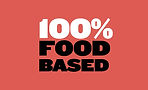
RAW RX is rethinking supplements—clean, food-based formulas with names that say exactly what they do. No fluff, no fine print.
We designed the packaging to match. After a close look at a crowded, overcomplicated market, we created a bold, clear system that cuts through the noise. Straightforward, vibrant, and a little cheeky—just like the brand itself.

VIBRANCY AT ITS CORE
Paired with chunky, no-nonsense type and high-contrast layouts, the visual system delivers clarity with attitude. It’s designed to feel fast, fresh, and unmistakably modern—because taking care of yourself shouldn’t feel clinical. It should feel good. And maybe even fun.


THE VISUAL IDENTITY
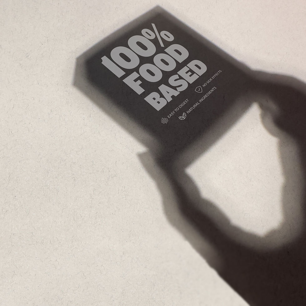
The RAW RX identity is built to stand out—and mean it. We chose Knockout for its bold, condensed forms that pack a punch without losing clarity. It’s assertive, straight-talking, and full of personality—just like the brand.
Product names follow suit: The Nothing Fishy, The Bond Builder, The Gut Instinct—each one says what it does, with a wink. It’s a naming system that’s functional, memorable, and never afraid to have fun.
The color palette seals the deal—vivid, high-contrast, and full of energy. Bright oranges, rich purples, punchy reds, and bold blues help each product feel like its own moment, while still living comfortably within a cohesive, confident system. It’s wellness, rebranded for people who read fast, think smart, and want the truth up front.


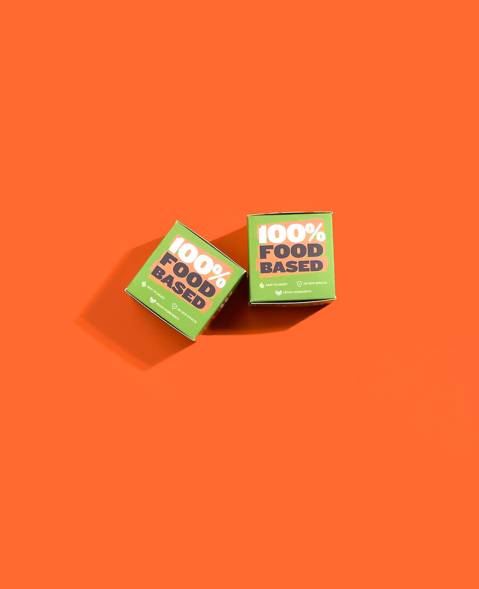
THE PACKAGING
RAW RX’s packaging got a bold upgrade—because what’s inside was always ahead of the game, and now the outside finally says so too.
We moved from clinical and conventional to clear, punchy, and full of personality. The new system leads with benefit-first product names, loud-and-proud type (hello, Knockout), and color that refuses to sit quietly. It’s designed to grab attention, build trust fast, and make supplements feel like something you'd actually be excited to pick up. No confusion, no clutter—just clean, functional design with a healthy dose of attitude.


LABELS AND MORE
We approached the RAW RX label redesign with one goal: make it effortless to understand, and impossible to ignore. After studying leading supplement brands across marketplaces, one thing stood out—most labels were either too clinical or too cluttered. So we flipped the formula.
Each label leads with what matters most: the benefit. Product names like The Gut Guardian or The Energy Hacker sit front and center in bold, blocky type, making scanning easy and shopping faster. A clear hierarchy, easy-to-read nutritional info, and a punch of color for each SKU ensure that every label feels distinct, while staying true to a cohesive visual system.


THE DETAILS
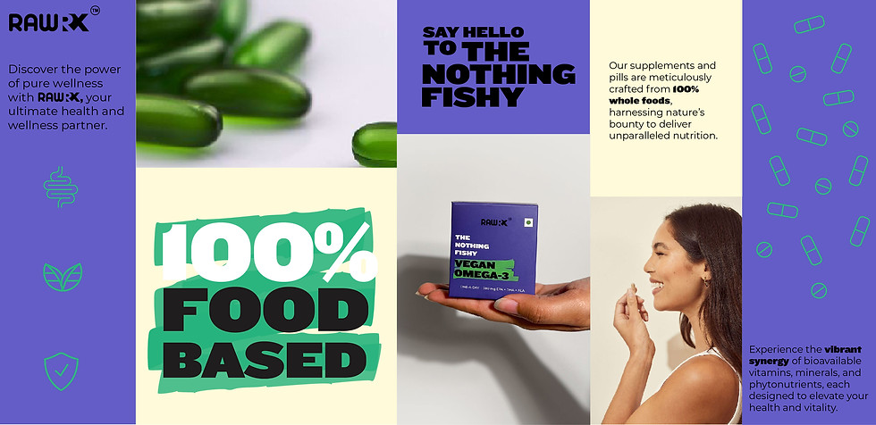
The RAW RX icons and infographics are designed to make science feel simple—and a little more human. Clean, colorful line icons communicate core benefits at a glance: gut health, clean ingredients, immunity, and more. No heavy claims, just easy visual cues you can trust.
Infographics like “Skip the Middlefish” break down complex ideas into bold, bite-sized visuals. They educate without over-explaining—showing why RAW RX goes straight to the source (like algae for Omega-3) in a way that's fast, friendly, and impossible to miss. Because smart choices shouldn’t need fine print.
A quick scan of the wellness category reveals a sea of sameness—soft greens, clichéd graphics, and jargon-heavy labels that blur together. Most brands lean on clinical cues or generic wellness tropes, often sacrificing clarity and personality. This identity breaks that pattern. With bold, type-led design, punchy color, and straight-talking product names, it stands out instantly—clean, confident, and impossible to scroll past. It’s a strategic choice: say more with less, speak directly, and make trust visual. Because in crowded digital shelves, you don’t get a second look—you get one shot to make it count.


